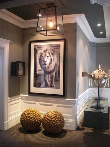
Well, as if all of the chic design in the Downstairs rooms at the Showcase House was not enough, we were treated to even more Upstairs. The anticipation built as we climbed the grand staircase. Nicole Hollis, the designer of the first floor hall also designed the upstairs hall. She carried the foggy grey colors upstairs and hung large scaled black and white photos of wild beasts, complimenting them with natural objects like skeletons, corals, insects and other natural curiosities.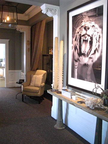 Her use of materials, such as stone, metals and natural linen fabrics reinforce the naturalist theme. She has very successfully carried off a tonal color scheme through her use of texture and contrast.
 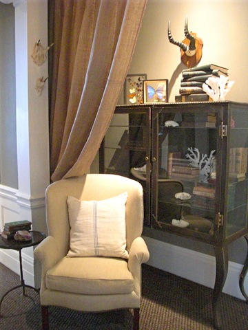 I just loved this metal apothecary chest! It was hard to move on from this space.
But we finally tore ourselves away. This next room was originally used as the Master Bedroom. But for the Showcase it is decorated as a guest room and called “the Constable’s Clouds”. The name comes from its color palette which was based on paintings by an English turn of the century water colorist, John Constable. Designed by Wendy Posard, this was probably the most traditional of the rooms designed this year.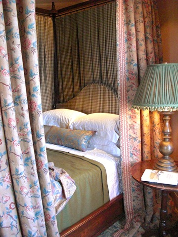
The space was warm and cozy, inspired by the English-Georgian architecture of the house.
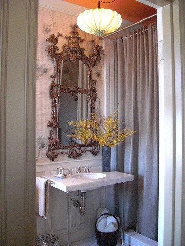
The original Master Bath was reworked by Lynn Amon Design. Ms. Amon kept the original marble vanity and added beautiful details like the new pendant light, a “contemporary translation of a Chinese Lantern”, and a stunning Chinoiserie mirror. She had orchids stenciled onto the walls which were then over-painted for a “faux linen finish”. I think what I like most is the tangerine ceiling color. That punch of color is happily unexpected.
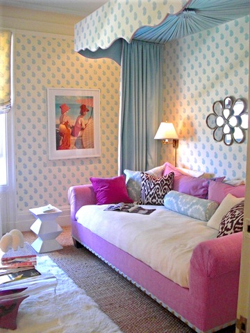
Next we happened upon this bright and happy “Teenage Daughter’s Room”. Designed by Palmer Weiss, this space was so fun and cheerful. I love the paisley fabric on the walls and canopy by China Seas. The pink velvet and Madeline Weinreb Ikat pillows add a fresh punch. Palmer Weiss incorporated items , such as the west elm sheepskin rug and a Lucite coffee table, that make this space realistic for a teenager as well. I appreciated that.
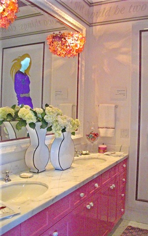
Nancy Van Natta designed the bathroom adjacent to this room, and made it a teenage girl’s fantasy. The pink lacquer cabinets and amazing glass floral sconces were so girly and fun!
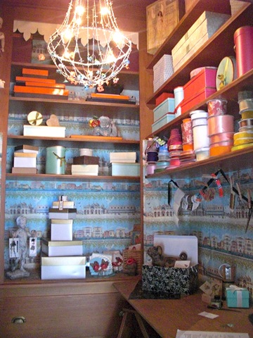
I had to include this photo of the little “Wrap Closet” off of the hallway designed by Gale Melton. I have always wanted a little wrapping niche like this and this one just reminded me of a miniature Laduree shop! So sweet!
One of my favorite rooms was designed as a Study for the woman of the house. Designed by Benjamin Dhong, the room incorporates everything I love in an interior space: antiques, contemporary art, color and natural elements. The combination of the sea grass floor covering, the French antique console, and the Koons “Puppy” vase….well…I loved it. Loved it all. 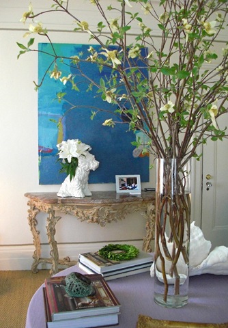
Benjamin was truly original in his placement of a fabric canopy behind the desk. Such a pretty idea! If you start seeing this in all of the magazines, you’ll know where it came from.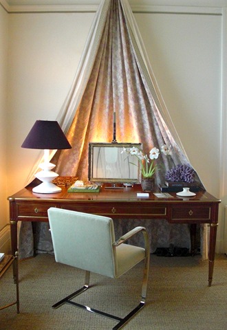
I had a really wonderful chat with Cecilie Starin, the designer of the Master Bedroom. This room was so luxurious with every detail beautifully thought out. The Chinoiserie screens set the tone for the black, white and ecru color palette.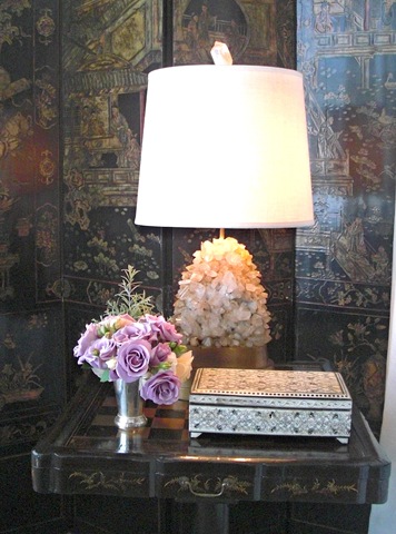 Cecilie designed the canopy bed herself, which is stunning, and I love the gunmetal velvet on the settee at the end of the bed. Perfect with the foggy grey throw casually tossed. It is really amazing how appropriate sea grass can be in almost any room!
A big thanks to Cecilie for her gracious welcome into her perfect Bedroom. She really took out time to speak with us and talk about her design company, which you can learn more about here. 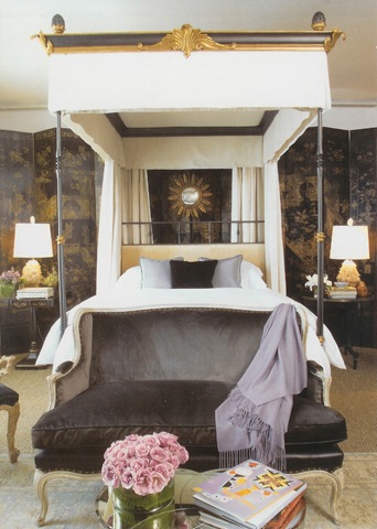 This photo from provided by Cecilie Starin
Very hard to leave this oasis, but push on we did.
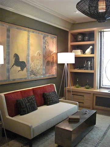
The Scheiber Group designed “His Sitting Room”. There were so many things to like here. It had a masculine feel which was not off-putting to we women. I loved the warm wall color, the pop of red on the sofa, and the Gary Hutton coffee table. The Eric Brand light fixture was a great feature in the space, as were the lamp and mirror from Ironies.
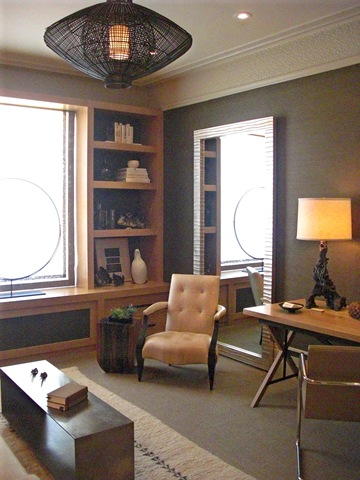 From here, we had one more floor to explore. The Penthouse was designed by Heather Hilliard. She was lucky enough to have a space that had the most stunning views of the house. Because the space had so many windows, and therefore alot of breathtaking light, it was a bit difficult to capture an image that did the space justice.
 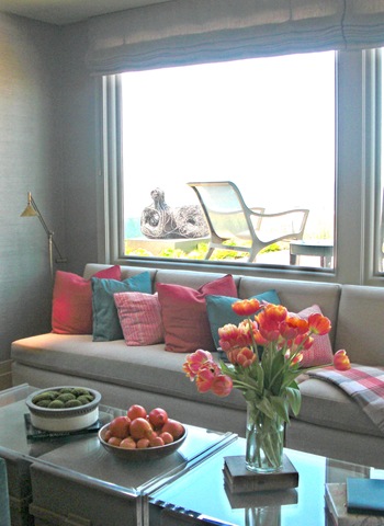 My favorite part of the room had to be the game table area. Love the chairs! The scale seemed small enough to be able to move them easily. They looked not only comfortable, but very chic!
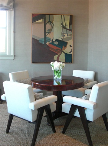 There was also a writing desk tucked in an alcove next to the stair. I could sit here and look out the windows and blog all day.
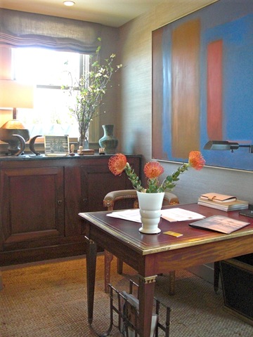
Or maybe I would just come out here instead! With these 360 degree views of the bay and the rest of the city, this roof top garden would be where I would spend pretty much all of my time. Yes, that is the Golden Gate Bridge in the background. You can also catch the dome of the Palace of Fine Arts.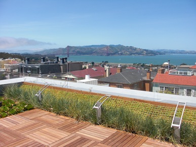
The garden was designed by Suzman and Cole Design Associates and was filled with a brilliant display of succulents and sculpture (from Terra Sculpture, I believe).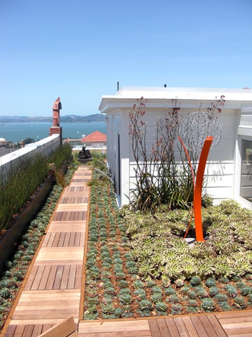 A gorgeous day…..all around!
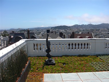 Alas….it was time to leave.
 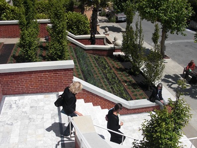 If we had to go….I suppose leaving by way of this marble stair case was not such a bad thing. We were also able to enjoy the front terraced garden by Christopher Yates.
I owe a big Thank You to the organizers of the San Francisco Decorator Showcase 2009! Thank you so very much for a wonderful event!
No comments:
Post a Comment